ButtonStyle
See the ButtonStyleDemo.cs.
using Gridrand.Contracts;
using Gridrand.RimGui.Manual.Utility;
namespace Gridrand.RimGui.Manual
{
/// <summary>
/// <see cref="ButtonStyle"/> demo.
/// </summary>
class ButtonStyleDemo : ManualBase, IManual
{
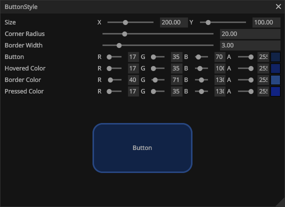
Color32 buttonColor = new(17, 35, 70, 255);
Color32 hoveredButtonColor = new(17, 35, 100, 255);
Color32 borderColor = new(40, 71, 130, 255);
Color32 pressedColor = new(17, 35, 130, 255);
float borderWidth = 3f;
float cornerRadius = 20f;
Vector2 size = new(200, 100);
float IManual.InitialWidth => 600f;
public ButtonStyleDemo(ManualBaseResource p) : base(p)
{
}
public void Draw()
{
DrawWidgetStyling();
}
void DrawWidgetStyling()
{
Gui.LabelSliderInput("Size", ref size, new Vector2(10, 10), new Vector2(500f, 500f));
Gui.LabelSliderInputFloat("Corner Radius", ref cornerRadius, 0f, 100f);
Gui.LabelSliderInputFloat("Border Width", ref borderWidth, 0f, cornerRadius - 0.01f);
if (cornerRadius <= borderWidth)
borderWidth = cornerRadius - 0.01f;
Gui.LabelInput("Button", ref buttonColor);
Gui.LabelInput("Hovered Color", ref hoveredButtonColor);
Gui.LabelInput("Border Color", ref borderColor);
Gui.LabelInput("Pressed Color", ref pressedColor);
var rect = Ctx.AllocateRect(height: size.y + 100f).CreateCentered(size.x, size.y);
// Set the color of the Button in this scope.
using (Style.Button.CornerRadius.Begin(cornerRadius))
using (Style.Button.Colors.Begin(buttonColor))
using (Style.Button.PressedColors.Begin(pressedColor))
using (Style.Button.HoveredColors.Begin(hoveredButtonColor))
using (Style.Button.BorderWidths.Begin(borderWidth))
using (Style.Button.BorderColors.Begin(borderColor))
{
if (Gui.NextRect(rect).Button("Button"))
{
Logger.Debug("Pressed Button");
}
}
}
}
}